The Psychology of Colour in Interiors: What to Choose for Each Room
Introduction
Color isn’t just about making a room look pretty. It’s about making it feel right.
Ever walked into a home and immediately felt calm? Or another that made you feel a little anxious for no reason? That’s the power of color psychology in interior design.
At Combine Design, we’ve seen first-hand how the right color scheme can lift your mood, help you focus, or even sleep better. If you live in Hyderabad or Bangalore, where space, light, and lifestyle vary drastically between localities, choosing the right colors for your interiors becomes even more crucial.
In this blog, we’ll break down how to choose room-wise colors for your home—backed by color psychology and Indian practicality.
🛋️ Living Room Colors: For Conversation & Comfort
The living room is where your family gathers, guests walk in, and impressions are made. It should feel inviting, energizing, and open.
Best Color Choices:
- Muted Greys with Mustard or Teal Accents: Keeps the space neutral yet lively.
- Warm Beiges with Terracotta Highlights: Earthy, timeless, and rooted in Indian aesthetics.
- Olive Green or Sage Walls: Adds freshness without overwhelming the eyes.
Psychological Effect:
Warm tones foster conversation and comfort. Natural greens and earthy colors create a grounded, balanced atmosphere—ideal for social spaces.
Avoid: Loud red or black walls—they create visual fatigue over time.
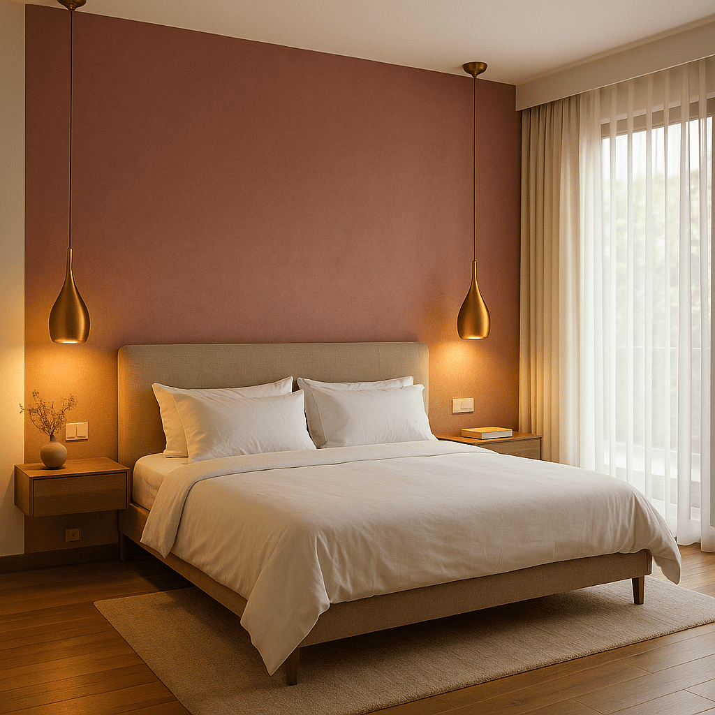
🛏️ Bedroom Colors: For Rest & Romance
Your bedroom is your sanctuary. The colors here should relax your senses and promote restful sleep.
Best Color Choices:
- Lavender or Dusty Pink: Calming, romantic, and great for couple bedrooms.
- Taupe, Mocha, or Mushroom Grey: Deep tones that feel safe and intimate.
- Muted Blues or Sea Greens: Especially for people dealing with stress or long work hours.
Psychological Effect:
Cool tones slow the heart rate and ease the mind—perfect for winding down after a long day. Soft warm tones increase emotional connection and comfort.
Avoid: Bright yellow or red—these can be too stimulating and may interfere with sleep.
Pro Tip: If you must use bold shades, confine them to cushions, artwork, or one accent wall.
🍳 Kitchen Colors: For Appetite & Energy
Indian kitchens aren’t just cooking spaces—they’re emotionally rich environments. From morning chai to late-night snacks, a lot happens here.
Best Color Choices:
- Pale Yellow or Mint Green: Brings energy and lightness.
- Off-white with Wood Textures: Feels clean, natural, and timeless.
- Warm Grey with Red Accents (backsplash or shelves): A subtle appetite enhancer.
Psychological Effect:
Yellow stimulates appetite and happiness. Green helps balance and reduce stress during long cooking hours.
Avoid: Dark blues or heavy black—they absorb light and can make a small kitchen feel even smaller
🧘 Study or Work-from-Home Nook: For Focus & Calm
Especially post-2020, our homes now include a workspace.
This space must support clarity, discipline, and calm.
Best Color Choices:
- Pale Blue or Soft Grey: Enhances concentration.
- Sage Green or Pastel Peach: Keeps the mind fresh during long work hours.
- Off-white or Bone Beige Walls + Natural Light: A blank canvas helps with focus.
Psychological Effect:
Cool colors slow the mind and allow for more focused thought. Soft greens help reduce screen-induced fatigue.
Avoid: Overuse of dark tones or neon accents—they disrupt focus and can strain the eyes over time.
🚽 Bathroom Colors: For Cleanliness & Peace
A well-designed bathroom should feel clean, quiet, and fresh—like a personal spa.
Best Color Choices:
- White or Powder Blue with Grey Tiles: Spa-like serenity.
- Aqua or Light Sea Green: Feels fresh and breezy.
- Matte Sand Tones with Gold/Black Fittings: Classy, modern, yet cozy.
Psychological Effect:
These colors subconsciously signal cleanliness and clarity. Blue, in particular, is associated with hygiene and calm.
Avoid: Very dark shades in compact bathrooms—they create a feeling of tightness.
🎨 Accent Walls & Decor Pops: Where to Get Bold
Want to use vibrant colors like red, mustard, emerald, or turquoise?
Use them on:
- One feature wall in the living or dining area.
- Upholstery like cushions, curtains, or ottomans.
- Art pieces, planters, or vases.
- Kitchen backsplashes in Moroccan tiles or printed glass.
Why It Works:
Accent colors draw attention without overwhelming the senses. They give rooms personality while keeping the base neutral and soothing.
🧠 How Color Affects Emotions (Quick Reference Table)
Color | Psychological Effect | Best Used In |
Blue | Calming, focus-enhancing | Bedrooms, Study rooms |
Green | Balanced, fresh, stress-relieving | Living rooms, Kitchens |
Yellow | Energetic, appetite stimulant | Kitchens, Dining corners |
Pink | Romantic, warm | Bedrooms |
Grey | Neutral, sophisticated | Living, Hallways, Bathrooms |
White | Clean, expansive | Bathrooms, Modular kitchens |
Terracotta | Earthy, rooted, cozy | Living rooms, Accent walls |
Black | Bold, luxurious (but heavy) | Trims, Accessories only |
Red | Exciting but over-stimulating | Dining chairs, Art pieces |
Regional Preferences: Hyderabad vs Bangalore
Hyderabad Homes:
Often prefer warmer tones, cultural accents, carved finishes, or sandstone-inspired palettes. Earthy neutrals and traditional hues like turmeric yellow or maroon are common in pooja areas or joint family homes.
Bangalore Homes:
Tend to lean toward minimalism, muted greys, Nordic-inspired blues, and light woods. Ideal for urban apartments and modern villas where natural light is prioritized.
Final Thoughts
Color isn’t just a visual choice—it’s an emotional one. The right shades can shape how you start your day, how productive you feel, and even how well you sleep.
At Combine Design, we don’t just pick colors based on trends—we choose them to reflect your mood, lifestyle, and city culture. Whether you’re designing a 2BHK in Gachibowli or a duplex in HSR Layout, we bring your home to life with thoughtful color psychology at the core.